Sunshine Sisters Brand Identity
Building on my previous work with Full Psycle Palm Springs, I was invited to create a brand identity for The Sunshine Sisters a group of professional women who have entered retirement and gather for connection, celebration, and creativity in Palm Springs.


Brainstorming with AI
To jumpstart the logo exploration, I used ChatGPT as a creative tool to help generate early visual concepts. I began by describing the design direction: a mid-century modern look inspired by Palm Springs, combined with a subtle desert feel that would reflect the group's environment and spirit. I asked ChatGPT to brainstorm logo ideas that embodied those themes, suggesting elements like simple geometric shapes, sun motifs, and imagery of women gathering together.
The first round of responses helped surface some familiar but useful themes many ideas included sun shapes and abstract representations of groups of women, often using clean, minimal forms. One concept in particular, in the bottom right, hinted at a silhouette-based approach that felt more emotionally grounded.
For the second round, I refined the prompt to include the actual name of the group and asked ChatGPT to focus more intentionally on the visual of two women drawing inspiration from the earlier sketch with an emphasis on connection, friendship, and mutual support. This shift led to the concept in the bottom left, which captured the tone I was aiming for. That idea became the foundation for the final direction and helped define the overall style of the brand.

Adding the Human Factor
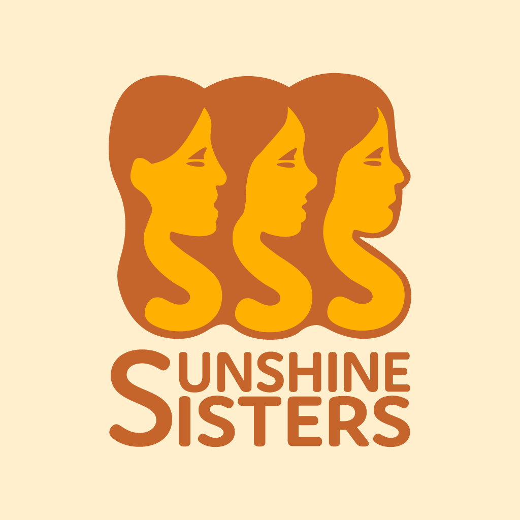
Inspired by the concepts generated through ChatGPT, I moved into Illustrator to begin developing my own interpretation. One of the first design shifts I made was in the positioning of the figures: rather than having the third woman face the others (as seen in the AI-assisted sketches), I reoriented her to face the same direction as the other two. This subtle change gave the composition a stronger sense of unity and forward motion.
Instead of duplicating a single character three times, I chose to create slight facial variations for each figure. This allowed me to maintain consistency in style while giving each woman a distinct identity visually reinforcing the theme of individuality within community.
As I began integrating the logotype, I noticed something interesting: the word "Sisters" contains three S's. When breaking down the full name Sun Shine Sisters there were three S's again. This pattern aligned perfectly with the trio of women in the icon. That realization became the foundation for the final mark: a visual merging of three women and three S's, symbolizing both unity and identity in a simple, elegant way.
Final Touches
The final logo builds on the idea of merging the visual and verbal identity into one cohesive mark. I shaped each woman's neck into a bold, flowing "S," which not only connects them visually but also echoes the repeating “S” in the name Sunshine Sisters. This decision helped reinforce the symmetry between the trio of women and the trio of S's across the name.
To further elevate that connection, I explored a layout that would give the “S” even more prominence. While my original plan was to stack the full name evenly, I realized that having one large “S” anchor both words felt more intentional especially when paired with the illustrated figures. By placing “Sunshine” on top and “Sisters” beneath, the layout creates a symbolic narrative: the sun above, shining down onto the sisters below.
The design also allows for a secondary version of the logo where the hair is removed, emphasizing just the letterform silhouettes. This flexibility makes the system adaptable across various formats while keeping the core symbolism intact individuality, unity, and identity radiating together.


