Full Psycle
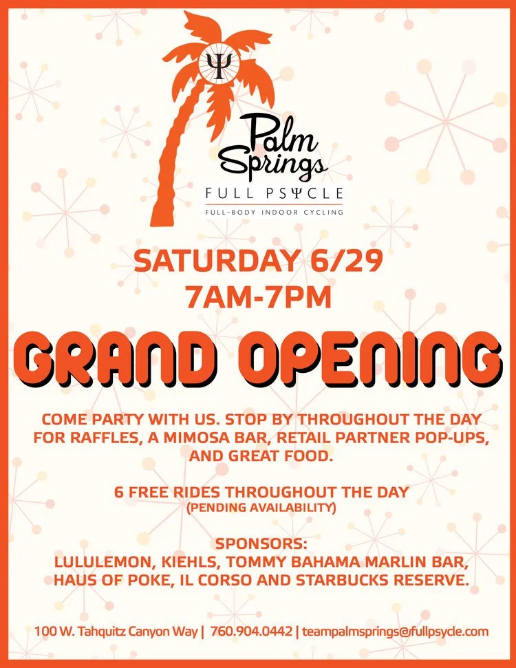
Palm Springs
Full Psycle Palm Springs is a spin studio franchise based in Palm Springs, CA. The franchise owners enlisted my help to personalize the studio's visual identity and establish a strong social media presence, ensuring a cohesive yet distinctive look that resonated with the local community.

Midcentury Meets Modern Fitness
When Full Psycle expanded into the Palm Springs market, the franchise owners were given a unique opportunity: while they were required to follow the core brand guidelines, they also had the flexibility to tailor the studio’s visual identity to better reflect the surrounding community. For the Palm Springs team, that meant leaning into the city’s signature midcentury modern aesthetic clean lines, warm tones, and a bold, retro-inspired sensibility that aligned with the desert lifestyle.
They brought me on to help bring this vision to life. My goal was to adapt the existing Full Psycle identity into something locally inspired while still remaining consistent with the national brand. I started by developing a custom logo variation that retained the original icon the wheel featuring the Greek letter for psyche but reimagined it through a Palm Springs lens, incorporating color, shape, and layout adjustments to reflect the regional vibe.
In addition to the logo, I worked closely with the team to create a cohesive suite of materials to support the studio’s launch and ongoing presence. This included in-studio signage and environmental graphics that tied into the interior design, merchandise concepts that reflected the local flair, and a range of marketing pieces to promote the studio both digitally and in print. I also built out a set of branded social media graphics to ensure consistency across all platforms and to help drive engagement from day one.
The end result was a unified brand experience that honored Full Psycle’s core identity while feeling unmistakably Palm Springs distinctive, stylish, and rooted in the energy of the community it was designed to serve.
Logo Design
When Full Psycle opened a new location in Palm Springs, I was asked to create a localized version of the brand’s logo—something that felt unique to the city while still aligning with the national identity. The owners wanted to retain the original wheel icon and signature orange but update the typography to reflect Palm Springs’ midcentury modern style.
Typographic Exploration
To find the right look, I researched vintage signage, local businesses, and landmarks throughout the Palm Springs area. That exploration helped guide the decision to move forward with a clean, geometric typeface that felt era-appropriate while maintaining the energy and boldness of the Full Psycle brand.
Icon Integration
The challenge was how to keep the corporate wheel icon while giving it a localized twist. After trying a few different directions, I developed a variation that merged the wheel with a stylized palm tree—a nod to the area’s iconic landscape. This visual connection helped the logo feel more rooted in place while still maintaining brand recognition.
Pride Variation
Later in the process, the owners requested a second variation for Pride Month. I created a rainbow-themed version of the logo using bright colors and palm elements to celebrate the local LGBTQ+ community. It was initially used for Palm Springs-specific social posts and merchandise but was later adopted by other Full Psycle studios who wanted to show their support.
Both the standard and Pride logos were used across marketing, signage, and studio apparel, helping to solidify a local identity that was both consistent and community-focused.


Social Media Wall Mural
As part of Full Psycle Palm Springs’ community-focused branding, the owners wanted a designated photo wall where riders could take post-class selfies to share on social media. The wall needed to be visually striking, on-brand, and unmistakably tied to the Palm Springs location.
Connecting Brand & Space
At the time, a local muralist had been commissioned to paint a large-scale piece in the front lobby. I saw an opportunity to tie the logo design directly into the space by extending the localized palm tree icon into a full-scale mural. Once I received the wall dimensions—particularly its height—it became clear that the vertical shape of the palm tree element would translate well into the composition.
Collaborative Execution
I worked closely with the muralist to adapt the logo into a mural-friendly format. We enlarged the existing palm tree mark, added a second tree to create symmetry, and introduced a subtle grey shadow for added depth. The design maintained visual ties to the logo while being bold enough to work as an environmental statement piece.
Outcome
The finished mural became a signature feature of the studio—doubling as a brand moment and a highly shareable backdrop for rider photos. It helped reinforce location identity and played a key role in driving social engagement both in-studio and online.


Marketing Assets
When I joined the team, we were initially provided with marketing materials from Full Psycle’s flagship location. These assets served as a temporary foundation while we began shaping a more localized and cohesive visual identity tailored to the Palm Springs studio.
Local Adaptation
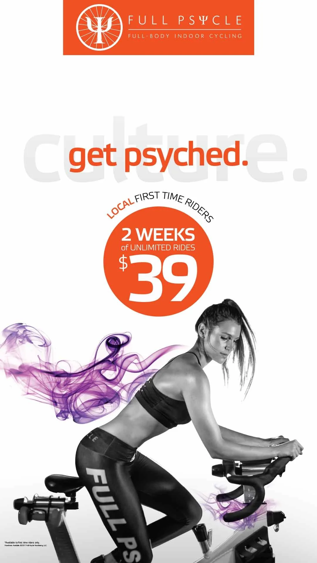
I adapted the national brand’s assets to create region-specific promotional content—including social media graphics, email campaigns, and flyers distributed around the city to generate awareness ahead of launch. These early materials helped build momentum while we finalized the new logo and visual direction for the studio.
Social Media Management
During the studio’s rollout, I also managed the Palm Springs social media account. I established a consistent visual language, planned and scheduled posts, and ensured the brand’s tone remained strong and engaging across platforms. As the team grew, I transitioned into a more collaborative role—continuing to design branded content while helping maintain visual consistency across all digital channels.


Merch Design
After finalizing the core logo for the Palm Springs studio, the owners asked me to create a Pride-themed variation to celebrate one of the city’s biggest annual events—Pride Week. The initial design was intended for a small run of stickers to distribute during the festivities and in-studio, but the response from riders and the local community quickly led to broader applications.
Pride Logo & Expansion
The Pride variation featured a bold rainbow color palette and integrated palm tree elements, blending Full Psycle’s identity with a message of inclusivity and local celebration. Due to its popularity, the design was expanded across apparel, merchandise, and social media graphics—becoming a seasonal staple that was also shared with other studio locations.
Retro-Inspired Variation
Alongside the Pride design, I developed a secondary version of the core logo with subtle, retro-style adjustments. This variation leaned into Palm Springs’ midcentury aesthetic and was used on limited-edition merchandise to offer a playful, location-specific twist on the original brand.
Both versions helped expand the brand’s visual language while reinforcing a deeper connection to the local community.


