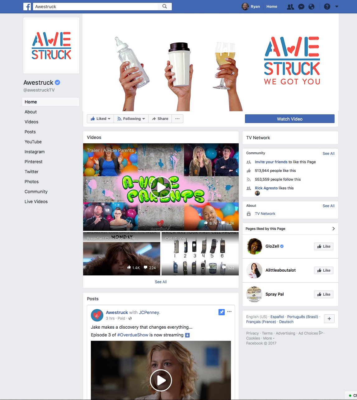
Awestruck Rebrand
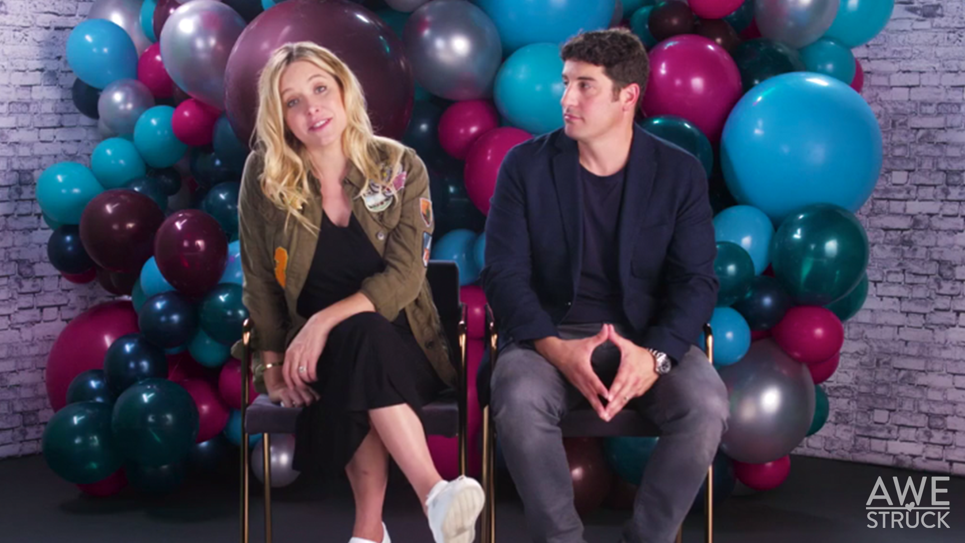
At Awesomeness, I worked on the Awestruck network, designing graphics for web series, social media, and branding initiatives targeting millennial moms. I led the rebrand, transitioning the visual identity from a playful, cutesy aesthetic to a more sophisticated, mature tone, refining the logo through multiple iterations.

Rebranding Awestruck: Finding the Right Voice
When I joined Awestruck, the network was in the middle of rethinking its brand identity. The existing logo featured a script style that the network head felt was too “cutsie” and didn’t reflect the more mature, empowered tone she envisioned for the platform. At the time, the team was in the process of converting the logo to a simple black version as a temporary solution until a more refined direction could be established. As we transitioned to this interim look, we also began organizing and updating all visual assets—especially those used across our social media platforms and video content. A key directive throughout the rebrand was clear: absolutely no pink. This rule became a creative constraint that guided the development of a bolder, more confident identity for the brand.


Logo Concept Exploration
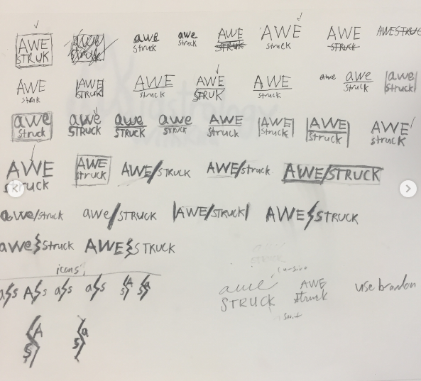
The initial phase of the rebrand focused on evaluating the original logo’s strengths and weaknesses. The script-style type was quickly identified as a misalignment with the network’s tone it felt too “cutesy” and didn’t reflect the bold, energetic personality the brand wanted to embrace.
Visual Structure
Based on direction from the network head, we explored separating “AWE” and “STRUCK” into two distinct components. I began sketching layout options and ultimately landed on a stacked wordmark that created stronger visual impact and hierarchy.
We decided to drop any custom type and instead leaned into Brandon, one of our core brand fonts, for clarity and consistency.
Rethinking the Icon
The heart icon from the original logo felt too sentimental for the brand’s new tone. Instead, we wanted something that conveyed volume something bold, expressive, and powerful. I explored several concepts:
Microphones, speakers, sirens, and a woman shouting visual metaphors for “being loud” or “making noise.”
The woman shouting concept resonated with our network head, sparking an idea for a future mascot.
From this point, I developed multiple visual directions:
Mouth Illustration: Positioned at the “A” to suggest a vocal burst like the beginning of the word “AWE.”
Hair Silhouette: Suggesting a female persona, hinting at a potential mascot idea previously discussed.
Thunderbolt: A simplified, striking symbol of sound and energy, used as the crossbar of the “A.” This direction created flexibility for a brand shorthand, where the “A” could stand alone as a secondary or icon version of the logo.
Versatility Built In
This concept not only offered a louder, bolder expression of the brand, but also introduced scalable elements like the thunderbolt “A” that could adapt across use cases, from full logos to quick social avatars.


Logo Redesign Process
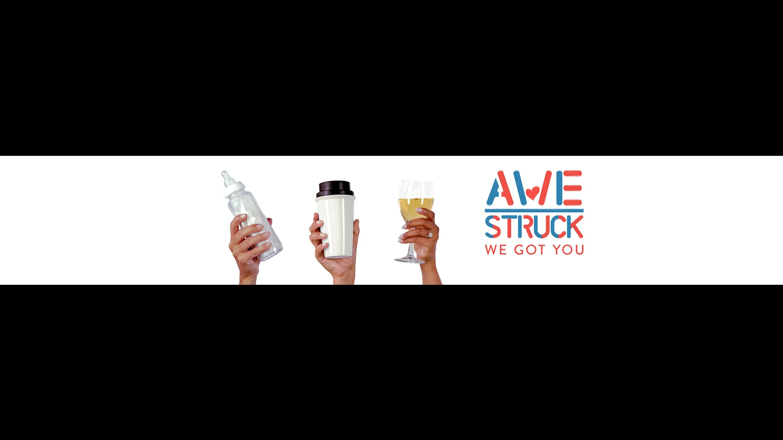
As part of the brand refresh, we made a conscious decision to retain the original heart icon to maintain continuity and recognizability. From there, the challenge was to reimagine its placement and color usage in a way that felt fresh but still aligned with brand values.
Icon Placement
Through experimentation with layout, we found that placing the heart beneath the center of the wordmark directly integrated into the stem of the “U” in “STRUCK” created a subtle yet emotionally resonant focal point. This not only grounded the heart but also introduced a unique structural twist to the overall composition.
Color Strategy
Initially, the heart was kept black, in line with the clean and minimal style of the rest of the logo. However, we wanted a way to incorporate color without disrupting the overall simplicity. The solution was platform-specific color variations:
Facebook/Instagram: The heart would appear in brand blue.
YouTube: The heart would shift to red.
Watermarks: Monochromatic (white or black) depending on the background, ensuring optimal legibility and contrast in various social media applications.
Final Touches & Revisions
After weeks of updating assets and applying the logo across brand materials, we were prepared for launch. But just before going live, the CEO raised concerns about certain aspects of the design. Although the feedback was relatively minor, it prompted us to reevaluate and iterate further ultimately leading to a more polished and vibrant final version.
This deck was created to introduce the rebrand to the CEO, guiding the presentation from brand strategy through to the final reveal of the new logo minus the heart icon. Rebrand Deck


Final Design
After a last-minute pause on the rebrand, we revisited the project with fresh eyes and clear feedback from the head of the company. The overall visual structure of the existing logo was still working well, so we focused on refining and elevating the existing elements—particularly the heart icon.
Refining the Heart
The heart was originally too flat and didn’t integrate well with the surrounding text. To address this, we added subtle highlight strokes, giving it more dimension and helping it read more clearly as a heart. These enhancements gave it a soft, balloon-like aesthetic, which inspired the next evolution of the design.
Cohesion Through Style
To ensure visual cohesion, we applied the same highlight and rounded effect to the text, creating a playful, inflated look that made the entire mark feel more unified and lively.
Color Integration
Originally, we considered having separate color versions of the logo to match different platforms—one red, one blue. But ultimately, we decided to combine both colors into a single version. This approach not only solved the platform inconsistency but also visually reinforced the idea of balance and harmony between elements.
A Happy Accident
While experimenting with layout and placement, the heart icon was accidentally dropped into the middle of the "W"—and it just clicked. Replacing the center of the W with the heart made the logo more distinctive and visually engaging, while still maintaining legibility.
Final Letter Tweaks
Encouraged by how the heart integrated into the W, we explored additional letter modifications, adding rounded edges, balance between red and blue elements, and playful geometry throughout to bring the entire logo together with consistency and personality.