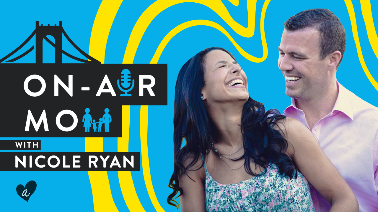
Web Series Design & Thumbnails
At Awesomeness, I helped shape the visual identity for various web series on YouTube and Facebook, designing title cards, thumbnails, lower thirds, and on-screen graphics. My work focused on enhancing storytelling, maintaining brand consistency, and creating eye-catching visuals to boost viewer engagement across platforms.

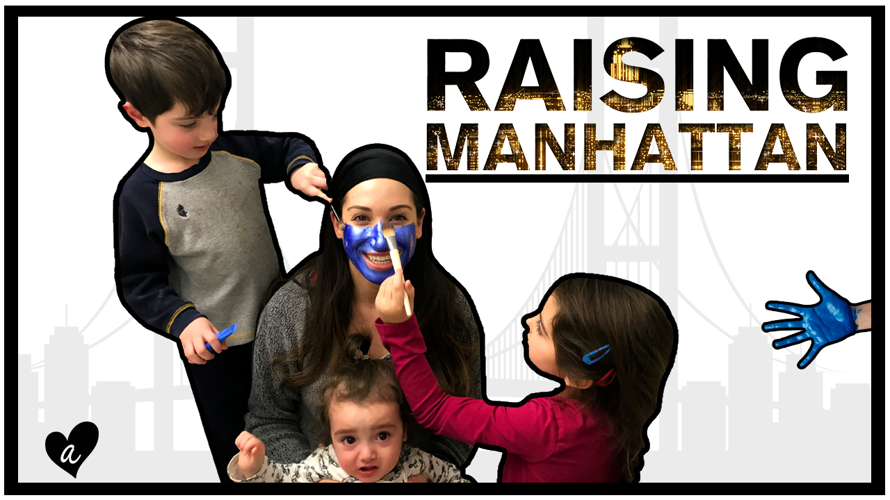
Raising Manhattan
A New York mom navigates life as a modern-day Carrie Bradshaw while raising four kids in a cramped NYC apartment. The web series explores parenting challenges, city life, and humorous takes on playdates, neighbors, and the idea of a fifth child all with the support of her eccentric Israeli husband. Inspiration came from my own experience of visiting Manhattan over the years. The clearest example is the lower thirds graphics which looks similar to New York Street signs. Originally the balloon on the title card was red to represent how New York City is called The Big Apple. However due to to the Movie IT being released around the same time it was decided to change the color to match the city’s lights.


Almost Divorced
An original web series that follows Glennis and Matt as they navigate the ups and downs of a relationship that nearly ended in divorce. Through candid conversations and honest reflection, the couple explores the challenges they’ve faced and the ways they might rebuild their connection. Inspired by Glennis' love for vintage 1950s fashion and design, I crafted visuals that embraced a mid-century modern aesthetic—drawing from my own time in Palm Springs to infuse the show with a warm, nostalgic tone. The graphic treatment, from title cards to lower thirds, helped reinforce the emotional honesty of the series while giving it a distinct visual identity that stood out across platforms.


Hot Guys Build Stuff
Guys Build Stuff is a lighthearted, visually playful web series designed as eye candy for moms, featuring muscular men often shirtless teaching basic building and repair skills. Each episode paired DIY instruction with humor and charm, making the content both informative and entertaining. For the visual identity, I leaned into a bold, construction-themed aesthetic that balanced grit with fun. Drawing inspiration from the ’90s sitcom Home Improvement and the bright, approachable color palette of Bob the Builder, the graphics helped set the tone with punchy title cards, lower thirds, and on-screen elements that embraced the show's cheeky, over-the-top vibe while staying accessible and engaging for the audience.


Other Thumbnails